
Apex Website Redesign
(Client Project)
An online health provider and referral service needed help to quickly modernise and develop webpages as their business expands.
I was tasked with rapidly creating responsive and WCAG compliant webpage prototypes that facilitate user conversions, and ease user experience issues present on other areas of the site.
Apex’s site undertook a small amount of user testing. From which - it was determined that user navigation was a significant issue. Primarily from the menu bar for mobile users not acting in expected ways.
Further, issues relating to text legibility and general accessibility needed to be addressed to be WCAG compliant.
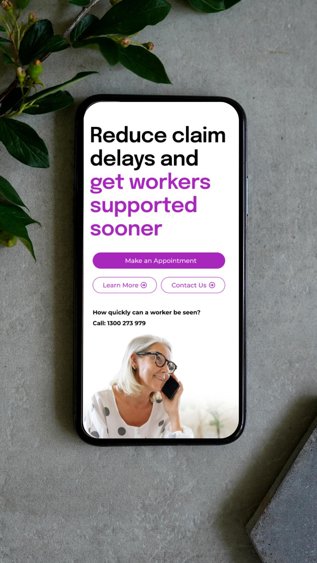


Apex Mobile Webpage Prototype 1
Web pages were developed to be mobile first to address the existing issues surrounding the websites mobile navigation. Further, the site is most often visited by mobile users, a smooth user experience focused on them would encourage the greatest number of conversions.
However, the client wanted responsive design across all hardware. So designs were made to accommodate that.
Apex Desktop and Tablet Webpage Prototypes
Once the mobile webpage was approved by the client, I moved onto designing that same webpage for desktop. To do this, I utilised the layout I developed for the mobile version and expanded upon it to be desktop and tablet friendly. This required planning during the development of the mobile page, as I chose images and formatted text in a way that would be easily translatable for developers to the live site whilst facilitating a smooth user journey to encourage conversions.
My designs emphasise text hierarchy to guide viewers through the site, with soft, faded images that blend into the brand coloured backgrounds This helped visual interest, text legibility and gave the webpage adequate negative space to present as professional and trustworthy.
User testing revealed users were more easily able to navigate the prototype, when compared to similar live webpages on the Apex site. Further, a significant portion of users reported the prototype as feeling markedly ‘more professional’ ‘trustworthy’ or ‘pretty’ when compared to the Apex live site.