
HGH Communications
(Post Grad University Project)
Overview
HGH, a telco that had long relied on their friendly brick and mortar stores needed a more efficient and effective way to encourage users to sign up to their mailing list. Additionally, they wanted to consensually collect more data from their customers.
I was tasked with creating a new user onboarding flow in a mid-fidelity prototype that can be tested with users.
Facing strict limits on budget and time, this project challenged me to rapidly develop and iterate on a working prototype that successfully met HGH’s business goals.

Project Walkthrough
Research
Research started by looking at the current process HGH had to sign customers up to their mailing list. I begun by mapping out the current state user sign up process - which is done manually by a team member at a HGH store. It is as follows:

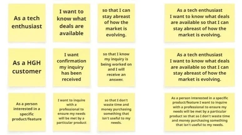
After looking at their processes, I researched what customers in this market wanted from their shopping and sign up experience. These insights were collated into user stories.
I found that HGH has a strong customer service culture, fostered by its friendly stores and sales reps. This was a key point of differentiation the business relied on to compete with larger companies and was particularly well received by older and less technologically literate customers.
I also found that customers currently see no value in signing up to HGH’s mailing list.
Requirements
I began by defining the clear success parameters and project scope. To do this, I compiled an exhaustive requirement log by analysing and synthesising stakeholder input, resulting in the following "must-have" and "should-have" parameters.


By analysing stakeholder documents and communications, the following criteria were determined:
Automate customer data collection.
Incentivize customers to sign up.
Ensure user details on sign up are entered correctly.
Collect data about what products the customer is interested in on sign up.
Confirm customer sign up.
Collect mobile numbers for follow up on email bounce and sign-up confirmation failures.
Concept Generation
Concepting started by creating a future state process map for HGH - which detailed how each requirement would be accounted for.

Initial Prototype Development
With a strong idea of how the future state system would meet the needs of HGH’s business and users, I moved onto initial prototype development.
I aimed to translate the friendly atmosphere of HGH's physical stores into their digital product. To guide design decisions, I developed a mood board emphasizing fresh, calming colours, rounded shapes, and simple, intuitive iconography, successfully replicating the in-store sense of welcome for the users.

Next - I created low fidelity sketches of the screen flow based off of the future state process map.
These paper prototype sketches were then processed into a rough clickable prototype in Figma. The prototype would be purposefully unrefined, so as to not waste time making something look professional, when core design elements may need to be iterated during testing.


Initial Prototype Usability Testing
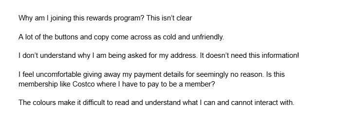
While the prototype successfully improved upon the current process by efficiently gathering more data, including a product interest survey, and confirming sign-ups, users expressed significant concerns. Many questioned the need for address and credit card information for a simple sign-up, with some even assuming Club HGH was a paid service.
The majority of users tested stated they would abandon the real sign-up process due to the excessive upfront collection of sensitive data.
Usability testing the first iteration of the HGH Sign Up funnel.
The main pain points the 10 users involved in the initial round of user testing repeatedly brough up the following points.
Understanding the shortcomings of the initial prototype, I was able to reiterate and improve the product to meet business and user needs.
Iterating Prototype Development
To prevent the potential onboarding abandonment issues mentioned during the initial usability testing, the user flow was changed to ask for sensitive information when the customer is primed to give it. Address and payment details were moved to the checkout flow, where customers already provide this information to successfully complete an order. A small checkbox for saving details for faster future purchases was implemented, a subtle way to still save this vital information so HGH may better understand its customer base if they opt in. The checkboxes were well-received by all 5 tested users who progressed happily without remark, unlike the original sign-up flow where all 10 users voiced concerns.
Further, by moving the request for the user’s address and payment details, we truncated the signup process, removing friction and increasing the likelihood of successful user onboarding.
Additionally, in the initial user flow, email and phone numbers were requested first for contact purposes (so HGH reps could follows these leads in the event of bounced emails, unverified sign-ups etc). However, this felt impersonal and antithetical to HGH’s friendly in-store customer experience. As such, I shifted to first ask for the user's name, then politely requesting additional details by the users name in subsequent onboarding steps to ensure a warmer, more familiar customer experience.

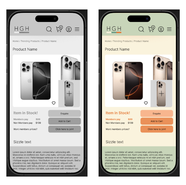
Next, I refined the prototype's color palette using the Adobe Color tool to ensure full compliance with WCAG 2.2 accessibility recommendations. Additionally, I validated the colour values by removing all saturation (a grayscale check) to clearly verify their relative visibility and contrast.

Mid-fidelity User Testing
The changes made between this version of the prototype and the initial version of the prototype were well-received by all 10 users who took part in usability testing. In this version, all progressed happily through sign-up without remark, unlike the original sign-up flow where all 10 users voiced concerns.
A user during usability testing successfully making their way through the sign-up process.
Limitations in User Testing
While this prototype has been successful, a lack of resources meant limitations to user testing scope, and should be taken into account when reading the final results. They are:
Customers were not filling out their details. They were simply navigating through the sign up funnel to demonstrate it is intuitive to use.
Due to a small budget allocation, user’s tested were not paid, and had a relationship with me as the UX/UI designer, meaning their assessment may be skewed.
User’s who underwent testing were observed by the UX/UI designer either in person or via Zoom, likely further changing how they interacted with the site when compared to if they were not observed.

Results
The prototype developed vastly improved the customer onboarding process, streamlined in-store operations for the client and enhanced the customer experience.
Our prototype digitised HGH's onboarding process, eliminating employee time sinks and reducing the risk of data leaks from manual handling.
Now, we collect customer preferences efficiently, allowing us to tailor product offerings for higher sales conversions and a superior customer experience. This also minimizes onboarding abandonment by avoiding lengthy or intrusive sign-up processes.
Finally, we've made the value of signing up clear and visible. Customers now see real-time member discounts prominently displayed on all key website pages, and they're consistently reminded of their savings at checkout, on product pages, and even while browse the homepage.
Automated Data Collection: Leveraged the HGH website for seamless customer onboarding.
Incentivising Sign-ups: The design prominently displays member discounts on home, product, cart, and checkout pages. An eye-catching orange accent colour also guides users toward signing up.
Ensure Correct User Details: Email verification ensures correct data entry during sign-up.
Collect User’s Product Interests: A short questionnaire gathers customer preferences on products, brands, and price points that can be followed up on by the HGH sales team.
Sign-up Confirmation: Implemented confirmation pages and verification emails so your users are confident they completed their tasks.
Collect Mobile Number for Follow-up: Users provide their mobile number alongside their email. If email verification fails, the HGH sales team can use the mobile number to follow up on the lead..